
From FarmWeather to FarmGo

This is a 10-min read. Due to confidentiality of information, details are deliberately omitted.
Background
When Yara first embarked on a journey to develop digital solutions that can support smallholder farmers, we conducted several research trips to different parts of the world to learn more about agriculture practices and challenges farmers face in big agricultural producing countries.
The research trips revealed many challenges that the farmers often face – market price uncertainties, pest and disease outbreaks, financing and more.
Fast forward a little more than a year after the release in 2019, millions of farmers across several countries have adopted FarmWeather, making it the top free weather app in India's Google Play Store.
Discovery/ Scoping
We knew that the merger of the released apps would not be an easy feat. The apps were built on different tech stacks, and there were differences in UX and design language. We quickly got together and conducted walkthroughs of the products, their histories, business case, past user research conducted, and the personas built.
Afterwhich we conducted an audit of both products going through all the features, and turned to analytics to inform us of features that users find most valuable and the least. We established the new product vision, mission, strategy, non-functional requirements (NFRs) and identified the risks and opportunities.

An example of an outcome of one of the workshops we had with colleagues across all disciplines. During this workshop, we break down into smaller teams to discuss a high-level user journey, the risks and opportunities, and each discipline's action items.
Define
With the information and insights that we have on the product goals, risks and opportunities we ironed out, these are examples of how-might-wes we defined:
- How might we enable farmers to be confident of the new FarmGo and transit into it easily?
- HMW encapsulate all crucial features while being a lightweight solution that is scalable to new markets?
The app’s primary persona would be fresh farmers and progressive farmers.
Devising a roll-out and sunset strategy
As crucial as the redesign of the merged app is the plan for how to roll out the new features. As FarmConnect will be part of FarmWeather, it is vital to have our users onboard on our merge journey and know what is happening.
We drew up a plan on how we want to communicate with our users on the changes in the app. The plan consisted of early-stage hints to users about a major update, gradual communications to walk through the new features and their benefits and an organic migration phase and a mandatory app update later. We also monitored the migration rates and decided on when to sunset FarmConnect.
Timeline to communicate with our users about the updates and examples of communication below.
User journeys and Information Architecture (IA)
The app's UX and IA were derived from a close collaboration with our team (Product Owners, Business analyst, Developers, Researchers, Data Analysts and Designers) and our stakeholders.
We developed user journeys in parallel to the IA of the app. That helped us stay focused on farmers' main goals and structure the content in ways that are easily accessible. Thereafter we came up with multiple hypotheses and the metrics we were going to measure.
A common problem that we have observed in both products is that farmers drop off during onboarding when we are collecting information about their farms. In the new flow, we adopted the reciprocity principle and redesigned in a way that
We believe that reducing the unnecessary information we collect during onboarding will contribute to helping farmers have a quicker understanding of our app's value.
We know this is true when we see an increase in users completion of their farm profiles and engagement with the features on first use.


We also reprioritised the information and redesigned the content on the Weather features based on insights from user interviews, usability testing, surveys and data. There were issues such as repetitive information being spread across multiple tabs that results in confusion, complex representation of weather information in the intraday section with raindrops and temperature graphs.
"To water my land, I need to spend Rs. 2000. If I know in the morning, It is going to rain in 6 hours, I won’t put pipes and will save money.” (Lucknow, CU)
Previous FarmWeather

Weather forecasts spanned across 3 tabs.
Current FarmGo

Weather forecasts consolidated into 1 weather tab.
We added Community and Notifications next and planned to display a modal to inform users about these new features. Contents in FarmConnect were also ported over to FarmGo so new users can discover the possible interactions in the Community and existing users don't lose their information. For E.g. Farmers can see other farmers asking questions, questions being answered by other farmers or an agronomist, sharing farm insights etc.
Previous FarmConnect / KSG

Community components spanned across 3 tabs.
Current FarmGo
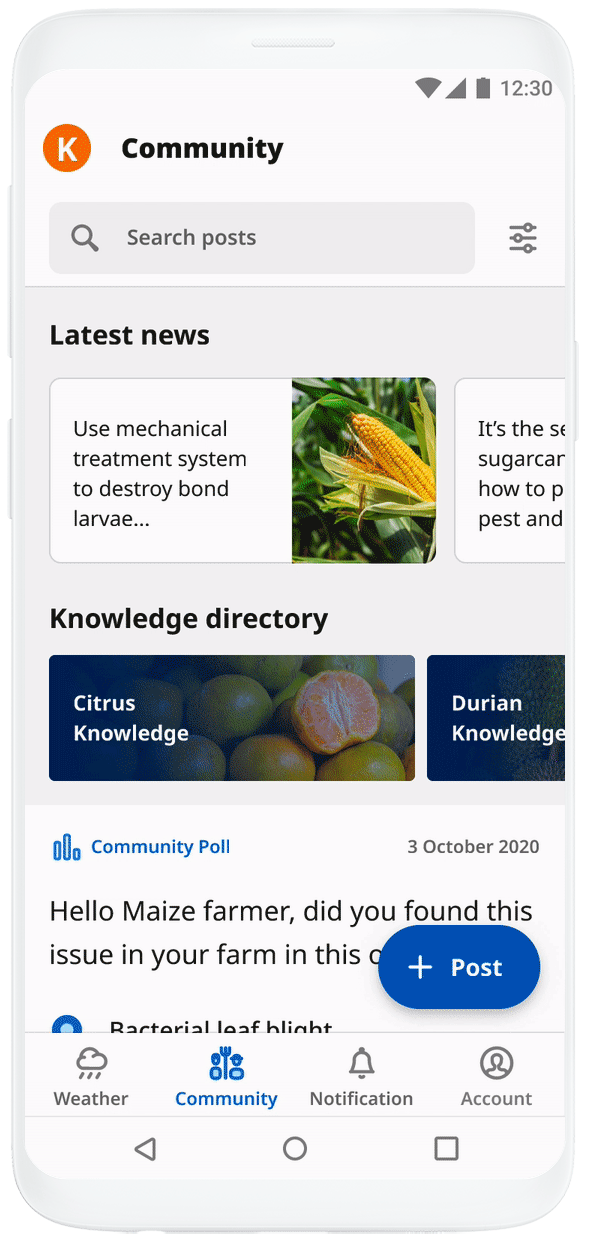
Community consolidated into 1 tab.
Usability testing
After many rounds of brainstorming, sketches, wireframing and prototyping, we took the prototype to test it with existing and new users to find out their sentiments of the new app and its usability.
In general, the sentiments from the farmers were positive – they welcomed the design, but there were also valuable insights we learned and iterated on.
Delivery and learnings
When we released the MVP of FarmGo in May 2021, the app's state was about 50-60% of what we envisioned. Many rigorous rounds of re-prioritisation happened with the team to deliver the most value we could in the time frame we had.
The released product has seen good traction during the adoption phase, and analytics shows users' enthusiasm in exploring the new features.
“Best for farmers, especially those who haven’t enough tech knowledge and use low specification device. I love this app and strongly recommend you try once.”
– Mr Jaswant, feedback from Google PlaystoreOne of my most significant learning from the merge is to
However, what we observed in production was some users not being able to understand our the product's value proposition and unable to find certain features that was moved around. As our users tend to be less digital savvy, we need a way to communicate more thoroughly and efficiently with our farmers. We can potentially explore sending out push notifications to farmers so they don't miss out on the updates and also implementing tutorials to navigate farmers around the app to help them learn about the new features.